First published , last updated
In this industry we talk about knowing, about understanding our audience, about how important that is. If we are to take that seriously, that means knowing that disabled people are part of our audience — and that means telling stories in a way that includes those people.
What is alt text?
Alt text is text attached to an image or graphic that describes that image for people who need that description. This seems fundamental but I'm writing it anyway: Alt is short for alternative, as in text that is shown as an alternative for people who can't see images.
All major social media platforms let you include alt text with your images. Not all make it easy, but for day to day social media use it's doable.
Why does alt text matter?
Because accessibility matters. Accessibility, the right to have access, is part of the law in the U.S. and around the world. The United Nations recognizes it. More than 100 countries have laws abolishing discrimination and eliminating barriers to accessibility for people who are disabled.
It helps your audience access what you publish. According to the Centers for Disease Control and Prevention’s latest Behavioral Risk Factor Surveillance System, as of 2022 29 percent of the 265 million adults reported some form of disability. The older you are the more likely you are to be disabled. Nearly 24 percent of those ages 18-44 have a disability, 29% of those 45-64 and 44% of those 65 and older.
Of all adults, 5.5% report a vision-related disability (up from 4.9% in 2020). Alt text helps those who use screen readers to understand a web page. How many people use screen readers? I have yet to find actual numbers on the share of adults who use screen readers.
How do I add alt text?
It depends on the social media platform. Here are how-to's for certain platforms (this section inspired by Patrick Garvin’s Effective alt text for journalists article):
Adding alt text on Instagram
There's a section labeled "accessibility" with a field in that section for alt text. For more, read Instagram's guide on how to add alt text.
Adding alt text on TikTok
This is TikTok's guide for accessibility on the platform.
Adding alt text on Bluesky
After you upload an image, a button "+ALT" appears on the preview of that image. Click or tap it to open the panel that allows you to add alt text.
Adding alt text on X.com
Near any photos you upload is a link "add description." Click or tap that. You can also read X.com's guide on how to add alt text.
Adding alt text on Threads
After you first upload an image to Threads, it will show you a preview with a button labeled "Alt" over the image in the lower left corner. Click or tap the button and there will be a place to add your alt text.
How to write the alt text
There are three main categories of alt text on social media: photos, screenshots of text, and graphics. Alt text works differently for each, so let’s do a quick go-through.
Photo alt text
Keep it short. Describe the who / what / where / when. No need to describe everything in the photo, just the important parts. This guide for journalists on alt text for photography gets into more detail.
An example of photo alt text

Here's a photo of me in one of my favorite shirts, this is the alt text that went with the Instagram post:
A photo of me in a tshirt with “2 LEGIT 2 QUIT!!! Spring Break '99” airbrushed on it.
Screenshots of text
Include as much of the text as possible.
Text screenshot alt text examples

The alt text attached to this screenshot on Bluesky:
Val Kilmer tweeting I once tickled Lou Reed. I regretted it for the longest while as he spoke to me few times after that dinner. But I'm glad now. He needed it.
Also, from a post of a screenshot of text from a New York Times article:

NYT excerpt that reads: Mr. Davis began working for Mr. Musk in 2003, when the tech entrepreneur plucked him out of a Stanford aeronautics graduate program. Mr. Davis became the 14th employee at SpaceX. He quickly endeared himself to Mr. Musk by finding less expensive ways to develop rocket parts, including making a shuttle steering device for a hundredth of the price. His frugality led to mistakes. In 2007, Mr. Davis removed components from SpaceX’s Falcon 1 rocket that prevented fuel from sloshing inside the vehicle, three former colleagues said. That caused the fuel to unbalance the rocket during a test flight, and it shut down midair before reaching orbit.
How to write alt text for graphics
If you’re responsible for graphics you’ve got a greater burden: You have a lot more to learn about alt text and, depending on the complexity of your graphics, you may also need to understand aria attributes.
Don’t just write “A bar chart.” No need to describe the colors or sizes of the shapes present either. Describe what the data is showing — ”a bar chart that shows the number of elephant stampede deaths per year in the United States since 1965.” Then, if it’s a lot of data, describe the range of data (“deaths range from zero to fifty thousand per year”). Describe notable trends, initial values, and final values, and what the takeaway is.
One quote of note from a New York Times interview with its in-house data visualization expert Jaime Tanner:
The Times worked with the American Council of the Blind to put together focus groups and surveys, which involved reviewing examples of alt text from articles we have published. There was a lot of feedback about how much extra detail we were including; readers wanted it short and sweet. On the other hand, they were telling us that the alt text we’d written for graphics — specifically maps — was often too simple. So now when we write alt text for graphics, we try to really hone in on all the vital information that’s there. That’s challenging for more complex displays like weather graphics, which are constantly changing.
But there is much, much much much more when it comes to data visualizations and alt text. I've written some on this as well (how our team made a complex interactive accessible and one approach to making a simpler interactive map accessible).
Data visualization alt text examples

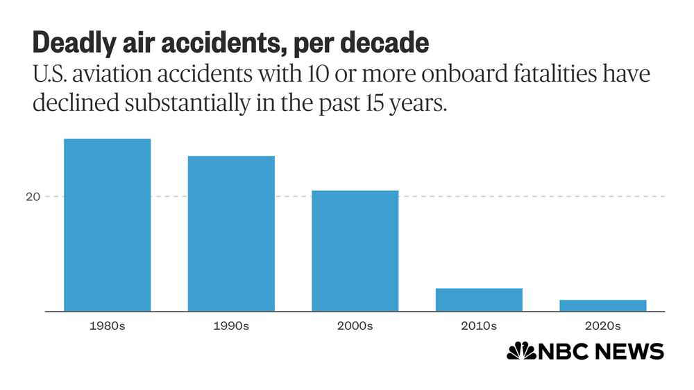
Here's alt text for this chart I shared on social media in January. Note that it’s simple enough to make describing all the data doable, this isn’t always the case.
This chart shows the number of aircraft accidents in the U.S. with 10 or more onboard fatalities per decade since the 1980s, when there were 30. In the 1990s there were 27, 21 in the 2000s, four in the 2010s and two so far in the 2020s.
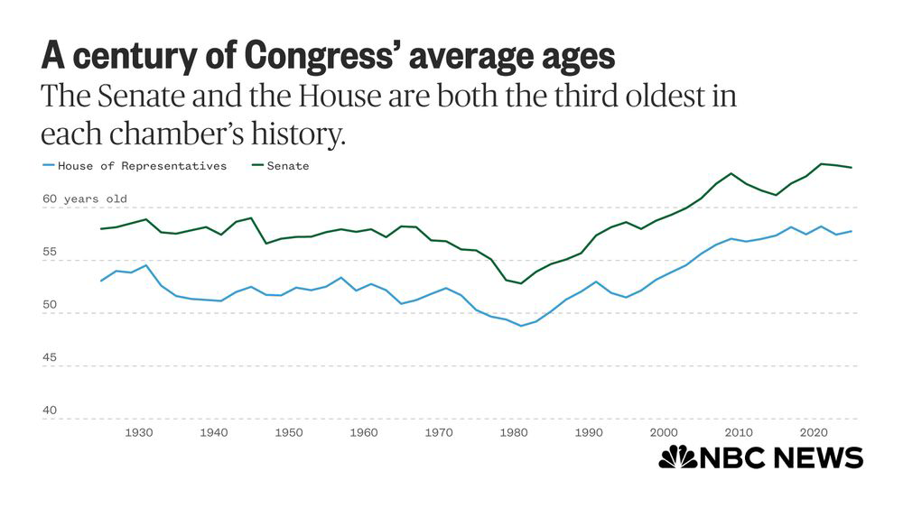
This is alt text for a post with an image of a more complicated line chart with more than one line:

A line chart showing the average age per Congress since 1925, with one line showing the average age in the House of Representatives and another showing the average age in the Senate. Both lines follow similar patterns, though the average age of a senator is five to 10 years older than the average age of a representative (in 1925, it was 58 years old in the Senate and 53 in the House). Each line holds relatively steady from 1925 to 1981. Starting in 1981, the lines both start climbing to their respective peaks, which they are currently near: As of 2025, the average age of a senator is 63.8 years old, and the average representative is 57.7 years old.
Resources and links for charts, graphics and alt text
- Sarah Fossheim’s An intro to designing accessible data visualizations
- Blind news audiences are being left behind in the data visualisation revolution: here's how we fix that
- Do No Harm Guide: Centering Accessibility in Data Visualization (the overview)
- "A non-exhaustive and in-progress list of people and resources in Accessibility and Data Visualization"
For more on alt text, Patrick Garvin's How to write effective alt text for journalists is a good read.
I'd also like to give Patrick Garvin a hearty shout-out for taking a read through this piece before it went up.
You can email me at joe.murphy@gmail.com, or find another way to contact me here.